David Hockney’s paintings never really grabbed me. I was familiar with some of his iconic yet dissimilar works such as We Two Boys Together Clinging and A Bigger Splash. I knew both were considered “important” but never really knew why. I couldn’t get too enthusiastic about his 2012 exhibition at the Royal Academy.
Tate Britain in London announces it is showing the first ever exhibition that covers the sixty years of Hockney’s work. After some reflection, I get on a plane.
The exhibition is causing quite some excitement in the UK and even on the BBC. I am determined not to be swept up by the hype. If I am disappointed or confused by the exhibition, I am going to say so. Harsh critic, me! The day does not start well. Yesterday’s visit to the dentist is proving painful. I am crammed in a commuter train. It is cold and raining hard. I arrive at Tate Britain fifteen minutes before the doors open. A crowd has already gathered. Friendly staff eventually unlock and let us all in. We drip our way across the marble floor to get in line to check our umbrellas and soaked coats. By the time I am in the first room of the exhibition, it is packed. A child is crying loudly. At this point, I consider walking out. But, with aching jaw, I decide to shuffle along with the rest of middle-class England. A man in a tweed jacket say to his wife “He was gay, you know!” She replies “Well, never mind, dear!”
The exhibition occupies twelve spaces arranged by chronolgy and/or influences. After my first tour, I go around again with the audio guide. I buy the handsome 270-page catalogue. I return the following day. This show is monumental in its scope and presentation. It contains some exceptionally beautiful pictures. To say I am bowled over is an understatement. Exhibitions will never be the same. Tate Britain makes manifest something about David Hockney that has previously eluded me; that he is Britain’s best-known living picture-maker because he is a towering genius. Yes, my opinion is modified somewhat!
We have to be “wowed” these days. As (or if) you view the Hockney exhibition, do not expect to be wowed by everything. Do not even expect to be wowed by the majority of his pictures; you will be wowed by some. What will certainly wow you is to reach the final space having glimpsed the sixty year creative trajectory and the staggering output of a man whose life is dedicated not only to picture-making but also, and more importantly, to addressing the inadequacies of all means of picture–making when it comes to representing in two dimensions the world we see and move in. My road to Damascus moment comes after viewing and reviewing Hockney’s life, influences and pictures along and in light of this trajectory.

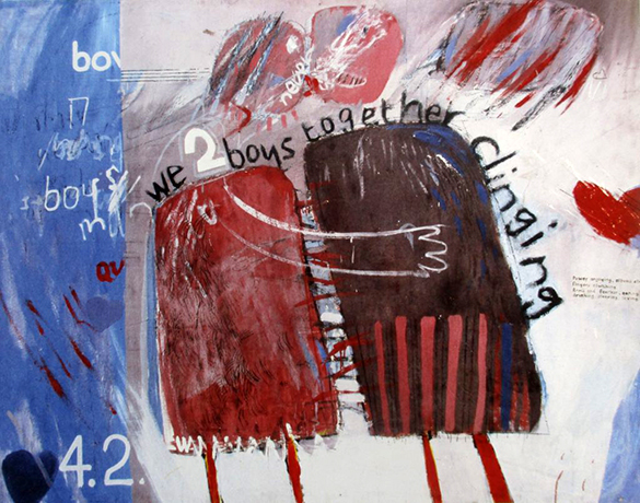
“We Two Boys Together Clinging” 1961 Oil on board 122cm x 152cm
The first room (A Play Within a Play) establishes a critical element of Hockney’s work. This is that a person’s visual perception of the picture is taken into account; the spectator is challenged, intrigued, amused, teased, confronted or manipulated. The collection from the early 1960s in the second room (Demonstrations of Versatility) amply demonstrates the 25 year-old Hockney’s disdain for painting’s protocols and etiquette and his rejection of social convention. His work at that time has been labelled both “pop” and “abstract expressionism.” In Hockney’s view, neither term applies. The paintings outrageously promulgate his homosexuality at a time when it was illegal. They are difficult to like. However, they show that whatever trajectory young Hockney was on, it was never going to be ordinary.
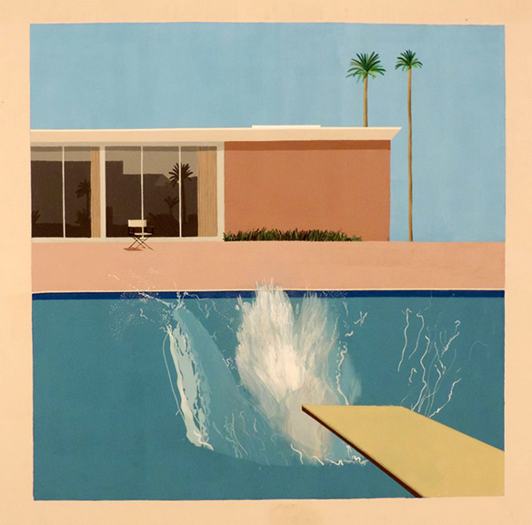
The next three rooms (Paintings with People In, Sunbather and Towards Naturalism) show Hockney abandoning his previous style and slowly progressing towards naturalism. This phase is closely linked to his love affair with California which began when he moved there in 1964. Expansive canvases show illusional domestic scenes, couples in relationships, sun-blessed swimming pools, light on water and glass, bare-bottomed young men, palm trees and a squeaky clean suburban Los Angeles. The later paintings are precisely executed. He waves two fingers at the Abstract Expressionists when he points out that the splash of his A Bigger Splash was meticulously painted with a small brush over weeks.

A Bigger Splash 1967 Acrylic on canvas 242cm x 244cm
In the last of these three rooms are two paintings that in different ways reveal the full extent of Hockney’s technical mastery of painting. Mt. Fuji and Flowers (1974) and Contre-Jour in the French Style (1974) are both mesmerisingly beautiful.
The exhibition leads us on to a room (Close Looking) that contains sketches from Hockney’s extensive travels and some truly exquisite drawn portraits. They provide a welcome break from the preceding huge canvases. This room is particularly popular with other viewers; they take much longer to stop and discuss. It prepares us for what comes next (A Bigger Photography.)

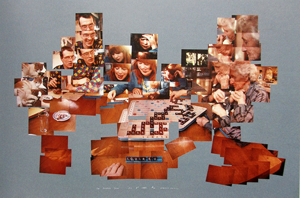
The Scrabble Game 1983 Photographic collage 99cm x 147cm
Hockney found photography an inadequate means to make pictures. He felt it was limited by the one-point perspective and the “frozen moment” of the image. Allowing himself the influence of cubism, he embarked on a process involving hundreds of photographs per work that resulted in some of the most arresting pictures – including portraits – ever produced by this medium. Fast forward four rooms to The Four Seasons (2010-2011.) On each wall of a square hang nine crystal-clear video screens that show a coordinated nine-screen-slo-mo-scene of the same English country lane; but each wall is dedicated to one of the four seasons. I am captivated and abandon any attempt to find adequate words. I steal them from the catalogue: “high-def post cubist movie”! And Hockney’s extraordinary digital adventure has only just begun!
The three intervening rooms (Experiences of Space, Experiences of Place and The Wolds) comprise large brightly coloured canvases painted from the early 1980s through to 2009. People move past them quickly. Experiences of Space is strongly influenced by Picasso and Chinese scroll painting as Hockney freely admits. These paintings also reflect Hockney’s interest in the design of theatre sets. Perspective is flattened and one’s eye is forced to move around the fragments of the composition. The provenance of Experiences of Place is Hockney’s draw to wide open spaces. It is the least approachable part of the whole exhibition. The three garish renditions of the Grand Canyon do not work as landscape pictures. The Wolds brings Hockney back to England. These large, bright, multi-canvas, non-naturalistic landscapes are certainly intriguing but don’t set my senses a-buzz.
The penultimate room (Yorkshire and Hollywood) contains 25 closely mounted, stunning charcoal drawings from 2013 of a springtime Yorkshire woodland. Shortly after their completion, Hockney returned to his home in Hollywood where, in 2015, he completed his most recent large canvases of his garden and famous blue balcony. Hockney is now 80 years old. Is the juxtaposition of the spring drawings with these paintings to be seen as a kind of beginning and end? Are we about to arrive in the final scene of an epic film?
I stand in the middle of the last room (iPads) surrounded by his digital paintings done between 2009 and 2016. Some evolve as I watch. I am enthralled as an original Hockney of a small cactus in a red pot in a blue mug on a yellow tablecloth appears in front of me over two minutes. Every style, subject, influence and medium finds its way onto these screens. His extraordinary trajectory is encapsulated here. It is the most brilliant summary of his life’s work and of the exhibition. It is also his legacy. However, I suspect Hockney’s trajectory is yet to come to ground. Whilst this room may, in reality and metaphorically, represent the final scenes of Hockney’s blockbuster, there is a hint of more to come; another episode. A bigger exhibition even?
So, here’s what I think. This is the most important, beautiful and satisfying exhibition you will see. Go! Even if you are determined to dislike or dismiss Hockney’s work, go! Mix with the crowd! Get stuck in! Lap it all up! Be outraged! Be awed!
All images of David Hockney’s work are reproduced here thanks to Tate Britain.

