Martin La Roche’s astonishing cityscapes

I meet up with Martin La Roche again. His ready smile reveals his continued enthusiasm for and commitment to his minutely detailed satellite-view cityscapes. Since our last meeting he has gone international. I find him setting up a new exhibition – opening Thursday 10th October – at the discrete and welcoming Espace Gaia in Geneva’s old town.

Martin La Roche 4

Martin La Roche with “Manhattan,” 2013

I remain mystified as to how he produces these drawings. He uses maps and web-based aerial images for reference but his ability to imagine the views that he then draws is astonishing.  Take a closer look! In “Manhattan” he gets away with depicting the Guggenheim Museum upside down!

Martin La Roche 5

Detail of “Manhattan”

One of his favourite travel destinations is Venice. He has drawn the city in his unique style and in doing so evoked a yingy-yangy thingy at the same time. Very cool!

Martin La Roche 6

“Venice” by Martin La Roche, 2013

Martin’s works have an instant appeal especially if you know the city in question. It is easy to imagine a La Roche on one’s own wall. These are not limited-edition prints. They are reasonably priced. My advice would be “Buy while you can!”

Espace Gaia is at 14 rue Calvin, Geneva (old town).

Laughing at Tate Britain

I visited Tate Britain last weekend. The current LS Lowry exhibition is sublime. Go and see it! There’s really not much that I could post on Talking Beautiful Stuff about this artist or his work that has not already been said. Leaving the exhibition exhilarated, I thought I would take a look at what else this sober and venerable British institution had to offer.

I walked into a tastefully but dramatically lit room that, at first glance, might house a Musée Barbier-Mueller exibition. People wandered around between the thirty-four “primitive” masks, carvings and icons. I couldn’t work out why these other visitors were laughing. There was something else going on here; something that made me take a second and then a third look at these objects.

Chapman 1

The Chapman Family Collection by Jake and Dinos Chapman, 2002, Photo: © Tate, London 2013

A press release accompanying the first exhibition of The Chapman Family Collection in 2002 at London’s White Cube gallery stated it was “an extraordinary collection of rare ethnographic and reliquary fetish objects from the former colonial regions of Camgib, Seirf and Ekoc, which the artists Jake and Dinos Chapman’s family had amassed over seventy years.” In fact, the collection is one work. Just reverse the names of the three tribes, read on and you’ll understand why people were laughing.

Chapman 2

Detail from: The Chapman Family Collection by Jake and Dinos Chapman, 2002. Photo thanks to Tate Britain. Note the yellow “M”!

Chapman 3

Detail from: The Chapman Family Collection by Jake and Dinos Chapman, 2002. Photo thanks to Tate Britain. Recognise the face?

Chapman 4

Detail from: The Chapman Family Collection by Jake and Dinos Chapman, 2002. Photo thanks to Tate Britain. Well… just to make it obvious!

Chapman 5

Detail from: The Chapman Family Collection by Jake and Dinos Chapman, 2002. Photo thanks to Tate Britain. This one really made me laugh!

Chapman 6

Detail from: The Chapman Family Collection by Jake and Dinos Chapman, 2002. Photo thanks to Tate Britain. This is my favourite!

The Chapman Brothers have been working together since 1991. They are no strangers to controversy. Their subjects have included Naziism and war-time atrocities. I cannot judge whether, by delicious mischief, the Chapman Family Collection succeeds or not in making a coherent statement about the interface of, on one hand, how primitive “art” is displayed and valued; and, on the other hand, modernism, and commercialism. However, this work caused me to laugh and what’s more laugh at Tate Britain. Chapman Brothers – Bravo! Tate Britain – Bravo!

Discovering James Rizzi

I will never have the opportunity to meet James Rizzi. He died at the age of 61 in 2011. This saddens me. Having discovered some of his last remaining work in Europe at the Galerie I.D in Geneva and having done a little research, I  know I would have really liked the guy. His output was prodigious. On-line photos show a mischievous smile. His beautiful stuff makes me happy.

James Rizzi 1

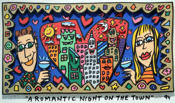
“A Romantic Night on the Town” by James Rizzi, 1994. Image thanks to Galerie I.D Geneva.

It is said that during his Fine Arts studies in Florida he had classes in painting, printmaking and sculpture. He decided to combine the assignments for all three classes in one work. So he made a drawing and printed it twice. He then hand-coloured both prints and cut out parts of one, mounting the cut-outs on top of the corresponding parts of the other. By using glue and wires, he was able to leave a space between the two. Thus his trademark 3D style was born. (And he got good grades for all three assigments!)

I love the way the buildings in his jumbled cityscapes are colourful characters themselves who observe and find amusement in the mass of colourful human characters. And the detail! In “Living Near the Water,” little green men arrive by flying saucer as yet unnoticed by the heaving crowd. The buildings are happy. The people are happy. The sun is happy. The moon is happy. Humanity is crammed down by the water’s edge or into boats. But we’re left with the feeling that there’s something off-stage. What is the event that has brought such a crush of people and the simultaneous arrival of the aliens?

James Rizzi 2

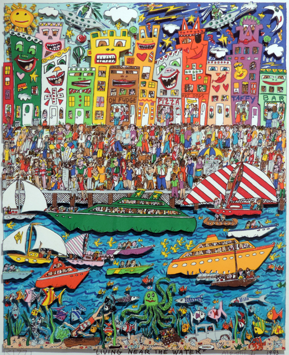
“Living Near the Water” by James Rizzi, 1993. Image thanks to Galerie I.D Geneva.

A big green octopus guards a treasure chest on the sea bottom. You could look at this for hours and never discover all the little laugh-out-loud passages.

James Rizzi 3

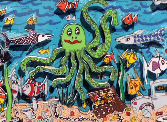
Detail of “Living Near the Water” by James Rizzi, 1993. Image thanks to Galerie I.D, Geneva.

In 1997, Rizzi was appointed the official artist for the Montreux Jazz Festival. His poster for the event is a masterpiece.

James Rizzi 4

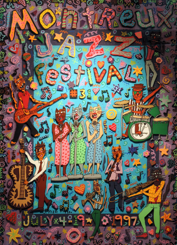
Poster for Montreux Jazz Festival 1997 by James Rizzi. Image thanks to Galerie I.D, Geneva.

I adore the three cat-back-up singers. You can almost hear them!

James Rizzi 5

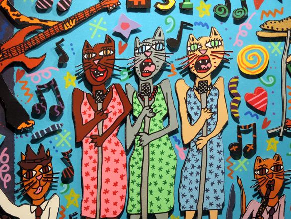
Deatail of Poster for Montreux Jazz Festival, 1997 by James Rizzi. Image thanks to Galerie I.D, Geneva.

In his inimmitable style he painted a Lufthansa jet, a VW beetle and whole buildings. In 2008, he won a commission to design stamps for Germany. No problem guessing which one of these three gents is Rizzi!

James Rizzi 6

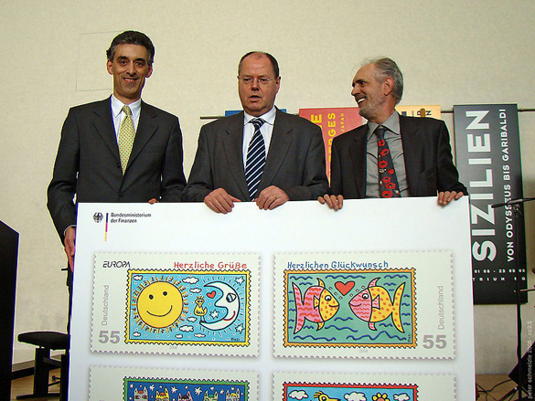
James Rizzi (on right) at the Inauguration of his German stamps in 2008. Image copyright: Peter Schmelzle.

But my favourite is “Visit My Friendly City.” It amuses and intrigues. Again, we have the characterful sky-scrapers and the little green men in space ships. But what is Rizzi’s humouristic off-stage story here? Why are the buildings all showing such anxiety (except the cool-cat-building)?  Do they know that the aliens will not, like tourists, find the city quite so friendly?

James Rizzi 7

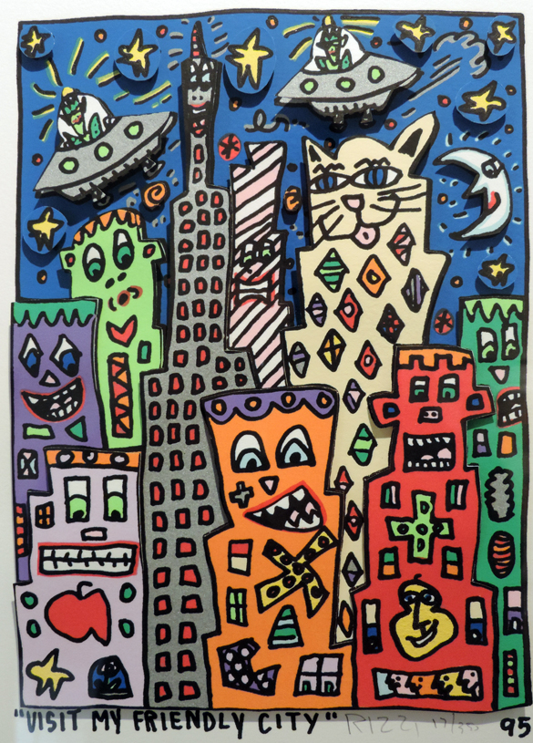
“Visit My Friendly City” by James Rizzi, 1995. Image thanks to Galerie I.D, Geneva.

In 2006, Glenn O’Brien wrote about Rizzi: “His merry maximalism and delight in delirious detail and elaborate minutiae created a true art brand, a trademark style as recognizable as any in the world.” Although I’ll never discover James Rizzi in person, my visit to Galerie I.D was a delightful discovery of his so instantly recognisable beautiful stuff.