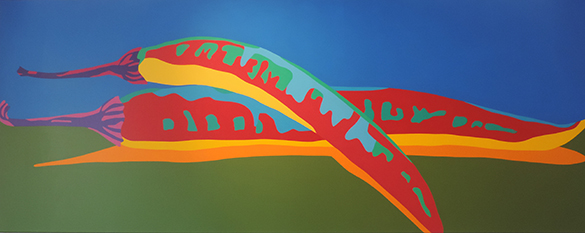
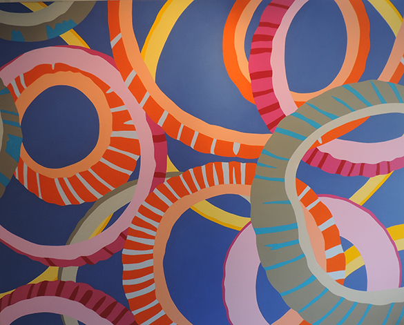
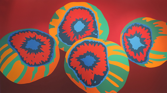
I visited Catherine Kirchhhoff‘s website before meeting her at her new exhibition. To be honest, on-line, her work didn’t grab me. It seemed just a bit too close to all those giant-sized, machine-printed photoshopped images that have filled so many galleries in recent years. I saw it as design (albeit pleasing design!) suitable for posters or tee-shirts. When I saw the paintings for real, I changed my opinion. I should have had more faith in the discerning Isabelle Dunkel. These are big beautiful paintings. The exhibition is another hit worth seeing at Galerie ID.
Catherine is an art teacher in a local school. She studied fine arts here in Geneva and also in New York and Los Angeles. She has exhibited widely. This is her fourth exhibition at Galerie ID.
 She tells me that, as a child, she loved to do very precise drawings. In adult life, she became fascinated by the design component of advertising. When in New York she realised her talent for working with big bold colours. The flash-of-light moment in which her signature theme was born was in a supermarket. She looked closely at the image of a food item on its packet. The image bore little resemblance to what was inside. Bingo! The stars aligned. Her work is now sought after. No surprise then that she won a prestigious commission for sixteen pictures destined for the walls of the new US head-quarters of Franke Foodservice Systems, the world’s leader in systems and services for the food industry.
In terms of human evolution, taste and smell – our detectors of chemicals – are much older senses than vision. Catherine manages to dislocate the old. She starts with banal images of food and reduces them to two dimensions. There is neither shadow nor perspective. The colours chosen are monotone, unexpected and clash in terms of temperature. Reality is kept at arm’s length. These skillfully displayed, broad canvases leap off the wall at the viewer before the food item is recognised as such. The overall effect is arresting but purely visual. There is no stimulation of appetite. The older senses are not recalled. I even hear a little warning voice that whispers “Don’t eat it!”
Fearful of irritating my fellow invitees to the opening, I examine the canvases close-up. This is master-class painting. Catherine creates these fabulous, even tones by painstaking application of multiple layers of undiluted acrylic. Not a single brush stroke is visible. The boundaries of the colours are razor sharp. You could still convince me that this is machine-printing.
Catherine recognises that her paintings might be termed “Pop Art.” Jasper Johns claimed that the term means simply “to take something and add to it.” This is precisely what she has done. And I have every confidence that, like so much great Pop Art, her work will end up being reproduced on posters and tee shirts. You first read about it here!


