I revisit my school-boyhood by wandering around Norwich Cathedral. The ecclesiastic, stoney-musty ambience evaporates as I turn into the vast building’s north transept. Under those near-one-thousand-year-old single-centered arches I find a sculpture that is beautiful, astonishing and haunting.
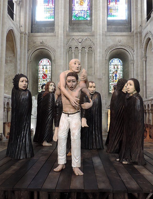
Ana Maria Pacheco “Shadows of the Wanderer” 2008, Polychromed wood sculpture
I am transfixed by these life-size figures illuminated by stained-glass sunshine. Other visitors stop and stare. I am sure that they too have a torrent of questions in their minds. What does it mean? How was it done? Why is it here? In hushed voice, a man asks his young son “What do you think of that then, Tommy?” After a few seconds of thought, the boy replies “Brilliant!” And it is. But I would love to know what he means by this.
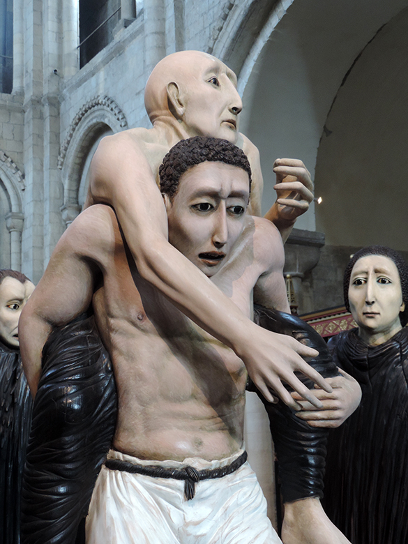
Detail of “Shadows of the Wanderer”
The central piece is a young man stepping forward with the weight of another, sick and fragile man on his back. He is exhausted and might be about to stumble off the crude platform. Both are carved from one piece of wood. Words of a song come to mind: “He ain’t heavy, he’s my brother!”
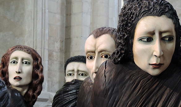
Detail of “Shadows of the Wanderer”
The other eight figures are also carved in one-piece. They are cloaked in ebony black. The eyes are onyx. The faces are exquisite, multi-ethnic and anxious. One person’s pain is clearly felt by the others. “Shadows of the Wanderer” is about exile, migration, vulnerability and above all fear.
Ana Maria Pacheco was born in Goiana in Brazil in 1943. She witnessed the cruelties and injustices of life under a military junta from 1964. In 1973, on a British Council grant, she won a place to study at London’s Slade. She went on to merit appointment as director of Fine Art at the Norwich School of Art (now the Norwich University of the Arts) from 1985 to 1989. She has exhibited at many of the major institutions in the UK including the British Museum, the Tate Gallery and the Victoria and Albert Museum.
Remaining close to her outraged roots, a central theme in all her work is the abuse of control and power and the vulnerability of the victims. So take a look at what I find when I cross the footbridge to the gallery at the NUA!

Ana Maria Pacheco, “The Banquet,” 1985, Polychromed wood sculpture
Pacheco’s “The Banquet” is grotesque and mesmerising. Four huge, bald, authoritarian men in black are invited to feast on a variety of cruelties about to be inflicted on a pleading and helpless torturee lying prone on the table. The proud host on the left encourages his gleeful guests to tuck in. On the right, the most eager is already rising from his seat with his eyes firmly fixed on the cleft in the poor fellow’s buttocks. This work, sculpted 23 years before, explains the fear and anxiety of “Shadows of the Wanderer.”
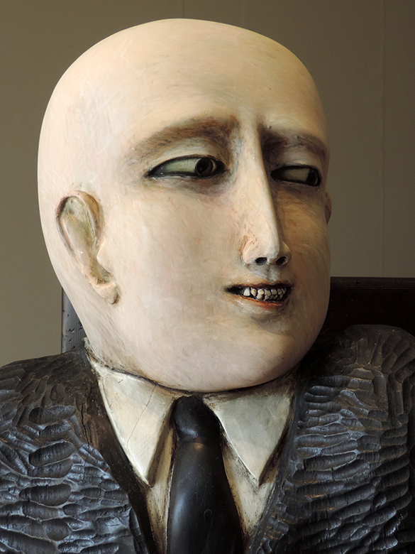
Detail of “The Banquet”
I wander around these figures. Again, the lifeful onyx eyes. No one is looking; I place a hand on the shoulder of the host. I feel no unbidden pulse of sadistic energy. But then I recoil with a bizarre mixture of disgust and admiration. Each figure’s mouth has real teeth implanted in its woody gums!
Norwich: a fine city! Ana Maria Pacheco is something of a rare and exotic bird for this very English place. Her technically accomplished work is like nothing else. It incites a tangle of emotions. It is impossible to point at influences. It draws on folklore, biblical myths, carnival, love, family, death and violence. Its human face recalls the amerindian, african and european ethnicities of Brazil. Above all, it is, as young Tommy said, brilliant. Utterly brilliant.
“Shadows of the Wanderer” and “The Banquet” are part of a four-way interlinked exhibition celebrating this versatile sculptor’s work in Norwich. The other locations are Norwich Castle Museum & Art Gallery and the Cathedral of St John the Baptist. Hats off to the curator, Keith Roberts!