
Geneva, 1 November, 2020
France, Belgium and Germany have last week gone back into lockdown. The UK will do so next week. Today, here, Geneva has announced that the main hospital has been swamped by so many COVID-19 cases in the last 24 hours that emergency measures will apply as of tomorrow; these include temporary closure of all non-essential businesses. A curfew has yet to be imposed. The Swiss borders may soon be closed again. The speed with which the case-numbers have increased in this “second wave” of the COVID-19 pandemic has taken European countries totally by surprise. There is already an active discussion on social media whether governments are to blame for incorrect policies and guidance or whether people are to blame for not doing what their governments have been telling them to do. This cuts both ways in my opinion.
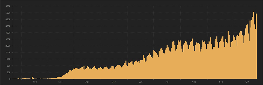
Here are the global cases per day according to the Johns Hopkins COVID-19 information site. Currently, there are half a million cases per day. And rising. This is really serious! Compare now with mid-March when we went into the first lockdown. (It is important to note that the service offered by Johns Hopkins is not the primary source of these data; the site compiles different countries’ reporting of their own COVID-19 statistics.) Below are the daily COVID-19-related deaths.
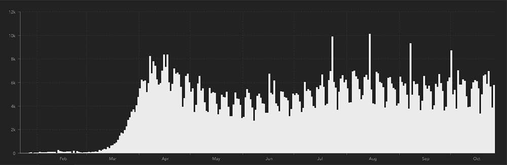
Taking a global view of things, these two graphs tell us a great deal about the pandemic and about data collection. First, we are not really living a second wave of this pandemic; we only have that impression because in some countries from around May to September we were able – to a degree – to control the number of cases through social distancing measures. Second, the numbers of daily COVID-19-related deaths have not risen since April. Third, there is a saw-tooth pattern in both graphs due to a seven day cycle; the lowest days are always Sundays.
As for the number of deaths not increasing in proportion to the number of cases, I found a very helpful résumé from 1 September entitled “Coronavirus cases are mounting but deaths remain stable. Why?” by Carl Heneghan and Tom Jefferson from Oxford University. This was published, surprisingly, in The Spectator. The authors propose that a number of factors are at play. Testing has developed in terms of who is tested, when and with what kind of test; as a result, the number of deaths as a proportion of cases could have changed with time. Treatment of serious cases is better and so hospitalised people are less likely to die. Younger people adopt fewer distancing measures and are more likely to become infected but are far less likely to die as a result. The vulnerable people most likely to die as a result of COVID-19 infection are now subject to stricter measures and are therefore less likely to be infected.
I have found no credible scientific explanation for the weekly cycle and the Sunday dip. It baffles and concerns me. I discussed this via zoom with my friend Nathan in Toronto. He is a statistician. He is the brainiest bloke I know. Meal-time discussions with his teenage sons cover issues like statistical truth and whether mathematics really exist. (I struggle to count how many shots I take in a round of golf!) I drew Nathan’s attention to the COVID-19 weekly cycle. He found it interesting and most amusing. I told him that the lowest day each week for reported cases and deaths was Sunday. This was greeted with unbridled laughter. “This must be some kind of major reporting bias!” I claimed assertively. Tears streamed down his face. “But this is the global COVID-19 statistics” I cried. “Surely, if stats are simply not reported on the day of rest then this is really, really serious!” At this point, Nathan had his head in his hands and emitted a sort of snorting noise. He obviously found my amateurish foray into his world just too much. When he was eventually able to talk, he said “What about Israel?” See what I mean? Very clever! So I dug into the national stats. Despite the sabbath being on Friday in Israel, they too have a Sunday dip. Interesting! So… those countries near the top of the league with a weekly cycle and a Sunday dip: USA, Argentina, Brazil, France, Germany and, earlier in the pandemic, the UK. Spectacularly, Spain has no stats reported on either Saturday or Sunday. No weekly cycle is seen in the stats from India, Russia, Italy, Iran or Colombia. The mystery remains. I hope that Nathan or someone with comparable cerebral capacity (if this were possible) will find time to comment on or even explain this.
What all this comes down to is how science is presented to an ever COVID-19-info hungry public. I am not saying that these statistics or reports are unhelpful or wrong but we should be aware that arriving at real scientific answers to the many questions that this pandemic throws up will involve valid scientific methodologies that in turn require study design, ethical approval, data collection, analysis, review and reporting in an appropriate forum. In other words, time! Just be cautious with respect to what you read and believe as this crisis evolves further – which it will. Be prepared to change your mind.
Nevertheless, I recommend a News Feature from 6 October in Nature by Lynne Peeples. It is a review entitled “Face masks: what the data say.” In brief, face masks do not replace strict social distancing measures; they are an alternative when such measures are not possible. Face masks probably lower the chance of an uninfected person getting the disease and of an infected person spreading the disease. Face masks possibly reduce the chance of serious outcome if a person nevertheless becomes infected by reducing the infective “viral load.” The most effective face masks are those made of two layers of material, are close fitting and are washable. The simple act of people wearing face masks may result in less risky behaviour.
Credibility is not only important in relation to data and science. Images that accompany COVID-19-related articles in the mainstream media should also be scrutinised with the truth in mind.

On day 11 of the Lockdown Diary, I had a bit of rant about false images of the coronavirus that are used to colour up news articles; they are computer-generated and bear minimal relation to an actual coronavirus. Last week, the BBC carried a concerning but credible report that the level of antibodies in people previously infected with COVID-19 may fall away rapidly so leaving them once again vulnerable to the disease. This article was covered by yet another starwarsesque image of a coronavirus (purple and fluffy this time) and – a first – surrounded by “Y shaped” antibodies on the attack. This picture does not make the science more accessible or credible. It simply draws the reader in through video game imagery. I’ve pointed out before that TV stations could get actors to deliver the experts’ scientific messages slickly and in a measured, serious voice rather than force us to listen to those umming and uhrring loveable geeks who, incidentally, know what they’re talking about. It’s about the integrity of the message.
In other major news from recent days, President Recep Tayyib Erdogan of Turkey is outraged by insults levelled against him in France. Above, I expressed surprise that The Spectator should carry a serious article about COVID-19 mortality. The link here is that, in 2016, The Spectator, astonishingly, ran a competition for who could write the most offensive poem about President Erdogan and obviously published the winner’s entry. The thing is that the winner was none other than the former editor of same rag, former Mayor of London, Member of Parliament for Uxbridge and South Ruislip, former Foreign Secretary, current Prime Minister of the United Kingdom and COVID-19 survivor, the Right Blondable, Boris Johnson. Quite the diplomat! I will leave you with his victorious limerick. I know…. I said be cautious about what you believe but this one is true.
There was a young fellow from Ankara
Who was a terrific wankerer
Till he sowed his wild oats
With the help of a goat
But he didn’t event stop to thankera
Boris Johnson’s poem
Great to see you are continuing your blogging journey, Robin. I really enjoyed the lockdown diaries! It’s fantastic that you noticed the “Sunday dip”.
I suspect the Sunday dip has nothing to do with the risk of infection going down on Sunday :-), but most likely has to do with the definition of a Sunday case. Is it the reporting date, specimen date, or symptom onset date? A quick Google search produced https://www.cebm.net/covid-19/epidemic-curves-organised-by-reporting-date-and-specimen-date/ which shows that the epidemic curves and the conclusions about the trend could look very different depending on the which data is used. In an Ontario (the Canadian province where I live) daily epidemiological summary up to Oct. 31 the Data Caveats section states: “Lags in … data entry due to weekend staffing may result in lower case counts than would otherwise be recorded.” (https://www.publichealthontario.ca/-/media/documents/ncov/epi/2020/covid-19-daily-epi-summary-report.pdf?la=en). Caveat emptor applies when trying to draw conclusions from public data dashboards, since none seem to address data quality and definitions in a serious way,