About Robin

Occasional painter. Golfer. Fascinated by humanity. Passionate about beautiful stuff, the people who create it and its narrative.

The ordinary and the extraordinary at the Ariana Museum

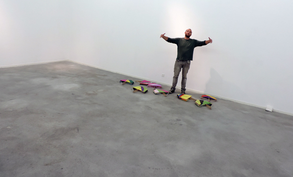
The new exhibition at Ariana Museum is very bold and very surprising. Two contemporary masters in the art and science of working clay are strutting their best beautiful stuff. Akio Takamori’s “Portraits ordinaires” (Ordinary portraits) and Jean Fontaine’s “En fer sur terre” (a clever untranslatable play-on-words in French about iron, hell, clay and planet Earth) combine for an absolute must-be-there opening on 26th September. We have produced a little video-montage to whet your appetites.

The contrast between the two exhibitions – wisely kept separate – can only be described as abrupt or even humorous. The beauty of Takamori’s ordinary Japanese portraits lies in their extraordinary ordinariness. The sleeping figures all sleep …  well… ordinarily! The adolescents show all the lingering anxiety that ordinary adolescents feel. If you are tempted to walk around these figures and move on, just walk around them again and pause. It took me a minute or two to appreciate these delicate, smooth and subtly coloured works with their admirable correctness of poise and form. The display platform for Takamori’s work is made of industrial wooden palates; it contrasts brutally with the sumptuous ambience of the Ariana. The next weeks will tell whether this attracts applause or censure.

Take the lift or climb the stairs and you will find a large room filled with Fontaine’s truly magnificent creations. Prepare for something that is more than surprising.  When I walked in there, what I saw hit me in the guts. In each ceramic work, ordinary things are bizarrely juxtaposed to fabulous effect. I offer here a few of the words that tore through my befuddled senses. Mesmerising. Fantastic. Absurd. Laugh-out-loud. Monstrous. Accomplished. Inspired. Inspiring. Masterful.

And there is more! You are encouraged to feel Fontaine’s work.  Let your hands find the words to do the rest of the talking about this truly beautiful stuff! This exhibition is a wonderful experience. Don’t miss it!

Discovering James Rizzi

I will never have the opportunity to meet James Rizzi. He died at the age of 61 in 2011. This saddens me. Having discovered some of his last remaining work in Europe at the Galerie I.D in Geneva and having done a little research, I  know I would have really liked the guy. His output was prodigious. On-line photos show a mischievous smile. His beautiful stuff makes me happy.

James Rizzi 1

“A Romantic Night on the Town” by James Rizzi, 1994. Image thanks to Galerie I.D Geneva.

It is said that during his Fine Arts studies in Florida he had classes in painting, printmaking and sculpture. He decided to combine the assignments for all three classes in one work. So he made a drawing and printed it twice. He then hand-coloured both prints and cut out parts of one, mounting the cut-outs on top of the corresponding parts of the other. By using glue and wires, he was able to leave a space between the two. Thus his trademark 3D style was born. (And he got good grades for all three assigments!)

I love the way the buildings in his jumbled cityscapes are colourful characters themselves who observe and find amusement in the mass of colourful human characters. And the detail! In “Living Near the Water,” little green men arrive by flying saucer as yet unnoticed by the heaving crowd. The buildings are happy. The people are happy. The sun is happy. The moon is happy. Humanity is crammed down by the water’s edge or into boats. But we’re left with the feeling that there’s something off-stage. What is the event that has brought such a crush of people and the simultaneous arrival of the aliens?

James Rizzi 2

“Living Near the Water” by James Rizzi, 1993. Image thanks to Galerie I.D Geneva.

A big green octopus guards a treasure chest on the sea bottom. You could look at this for hours and never discover all the little laugh-out-loud passages.

James Rizzi 3

Detail of “Living Near the Water” by James Rizzi, 1993. Image thanks to Galerie I.D, Geneva.

In 1997, Rizzi was appointed the official artist for the Montreux Jazz Festival. His poster for the event is a masterpiece.

James Rizzi 4

Poster for Montreux Jazz Festival 1997 by James Rizzi. Image thanks to Galerie I.D, Geneva.

I adore the three cat-back-up singers. You can almost hear them!

James Rizzi 5

Deatail of Poster for Montreux Jazz Festival, 1997 by James Rizzi. Image thanks to Galerie I.D, Geneva.

In his inimmitable style he painted a Lufthansa jet, a VW beetle and whole buildings. In 2008, he won a commission to design stamps for Germany. No problem guessing which one of these three gents is Rizzi!

James Rizzi 6

James Rizzi (on right) at the Inauguration of his German stamps in 2008. Image copyright: Peter Schmelzle.

But my favourite is “Visit My Friendly City.” It amuses and intrigues. Again, we have the characterful sky-scrapers and the little green men in space ships. But what is Rizzi’s humouristic off-stage story here? Why are the buildings all showing such anxiety (except the cool-cat-building)?  Do they know that the aliens will not, like tourists, find the city quite so friendly?

James Rizzi 7

“Visit My Friendly City” by James Rizzi, 1995. Image thanks to Galerie I.D, Geneva.

In 2006, Glenn O’Brien wrote about Rizzi: “His merry maximalism and delight in delirious detail and elaborate minutiae created a true art brand, a trademark style as recognizable as any in the world.” Although I’ll never discover James Rizzi in person, my visit to Galerie I.D was a delightful discovery of his so instantly recognisable beautiful stuff.

Marcelo Jacome: colouring space with kites

I take a wrong turn in the cavernous premises at 43 route des Jeunes, Geneva. The team from Espace_L are discussing their huge white walls in rapid Portuguese. They are amused that I ask to look around an empty space. They offer me a glass of wine. I find a young man untangling the fine strings of hundreds of paper kites.

Marcelo Jacome 1

I learn that Marcelo Jacome’s “Pipos planos” (kites) has recently caused a sensation at Saatchi Gallery‘s exhibition “Paper.” I have the good fortune to stumble across him installing his masterpiece here. This is serendipity indeed. And…. My! Oh! My! Take a look at what Saatchi found!

Marcelo Jacome 2

My first impression is of weightless, delicate butterflies driven en masse along a migratory route by some primordial urge. But then there is something human, dynamic and temporary about the chaotic shapes and hues: the tents at a massive rock festival maybe? Whatever, it fills space with colour and lifts the spirits. I am thrilled that I can see this work and others for real at the opening at Espace-L on 17 September.

Marcelo interrupts his work for a chat. This charming thirty-three year-old Brazilian architect took up painting eight years ago. His large studio led him to move from two to three dimensions and to explore what he terms “the chromatic mass of urban spaces.” He is animated in describing his journey. His influences? Henri Matisse and Arturo Bispo do Rosario. His music? Jazz! The best part of his international career? Meeting people! The worst part of his international career? Meeting more people! Who’s going to win the next world cup? Marcelo puts his head in his hands. “I hate football!” This is a very unusual Brazilian! I leave him to work out how he’s going to complete his installation.

Marcelo Jacome 3

Boa sorte, Marcelo!