
Michael Dean
I pluck up courage to visit the exhibition by the four shortlisted candidates for this year’s Turner Prize. I am not sure that anything I have to say is relevant. This is, after all, one of the most prestigious international visual arts awards; it specifically celebrates new developments. Unsurprisingly, it is probably the most controversial as well; especially since that bed business. But Tate Britain asks visitors for their opinion. So, here goes!
I ask the helpful staff member personning the entrance if it’s safe to go in there. She laughs. She is well used to the occasional barbed comment; this is about as contemporary as it gets. We chat. She assures me that there is nothing a five year-old could have done. It’s my turn to laugh. She has a preference but feels she should keep this to herself for fear of prejudicing my visit. She agrees to tell me when I come out.
Helen Marten (Photo: Martin Godwin for the Guardian)
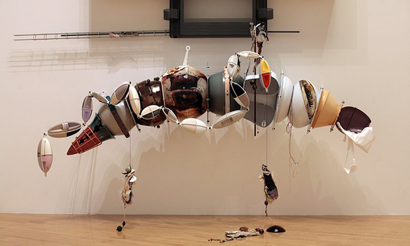
The first space is given over to work stations each housing a construction by Helen Marten. They are bizarre and baffling. However, their placement is careful. Their construction is complex and heterogenous in source material, colour, texture and form. I am drawn in to examine them minutely. The close encounter is gratifying.
Helen Marten
Despite a steampunkish feel, there is, at the same time, something quiet about Marten’s work. It is proportioned. It is unthreatening. It does not confuse.
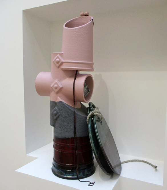
Anthea Hamilton
The next space is lined by brick-wall-paper. In one corner, a matching suit is suspended on a hanger. Whilst trying to assimilate this easy-on-the-eye juxtaposition, I turn around…….
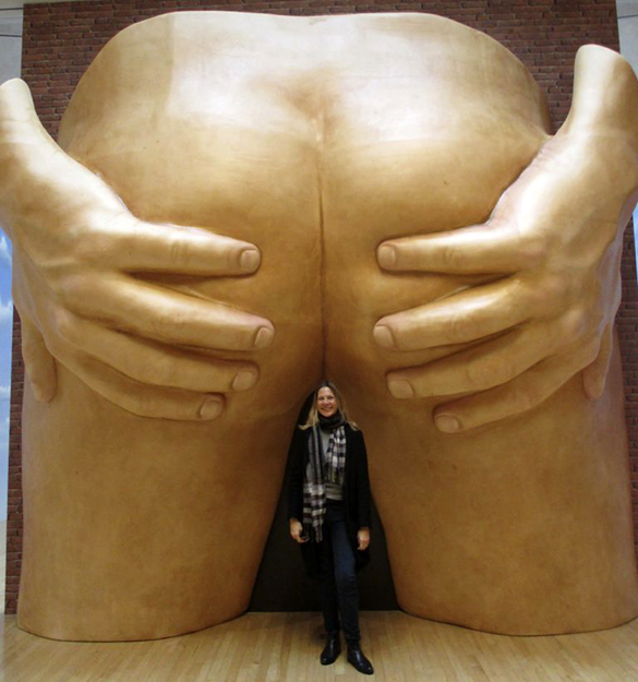
Anthea Hamilton
On the opposing wall, drawing sniggers from other viewers – one of whom who was kind enough to take a direct sub-anal stance for scale purposes – is…. well…. description is superfluous. It is, apparently, a direct take-off of a 1970s proposal by designer Gaetano Pesce for a doorway into an apartment building in New York. The back door?
Anthea Hamilton’s space is brazen. It provokes a reaction, for sure. My problem is that I am aware that my reaction feeds off a latent schoolboy sense of humour. I struggle to find aesthetic appeal. Is this important? Despite my years as surgical registrar on the proctology unit of University College Hospital, London, I want to by-pass the self-pulled-apart buttocks (‘Ere, Doc, take a look at this!) I want to look away. The cocktail of amusement and discomfort is unique. I feel a creeping embarrassment that, by appreciating it as contemporary “art,” I might become a figure of ridicule. I harbour a forlorn hope that somehow, the trousers of the suspended suit behind me are pulled up over this supersized bum. I would love to know if this paragraph represents mission accomplished for Hamilton.
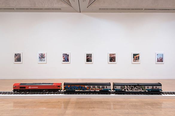
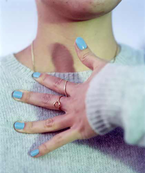
Josephine Pryde
The next, more modest space is taken by Josephine Pryde. It is something of a relief. It also, I am sorry to say, leaves me a bit flat. In the centre of the room is a model train. I read the Turner Prize text. “The New Media Express in a Temporary Siding (Baby Wants To Ride) is a scale model of a Class 66 diesel locomotive and carriages in DB Schenker livery. The carriages are tagged by graffiti artists from the cities in which the train has previously been exhibited…”
Josephine Pryde
On the wall Pryde has hung a series of closely cropped photographs of well-manicured women’s hands. Each image shows the hands in contact with, for example, clothing, a book or a mobile phone. I read that “our attention is drawn to the point at which the body and the object meet and to the gestures the hands perform.” I’m struggling.
One more space to visit and I am not sure I have yet seen my new friend’s preferred work. And then, as I edge myself into the next space, it is obvious (and is later confirmed when I leave.) I am in Michael Dean’s beguiling white-out-scrap-heap-alphabet-jungle. I am confronted first by tight angry cement fists impaled on a coiled steel reinforcing rod. I feel an immediate little burst of outrage; about what, I am not sure. I squeeze around the margins of this mesmerising jumble of discarded materials. From a visual perspective, I cannot help be drawn into it.
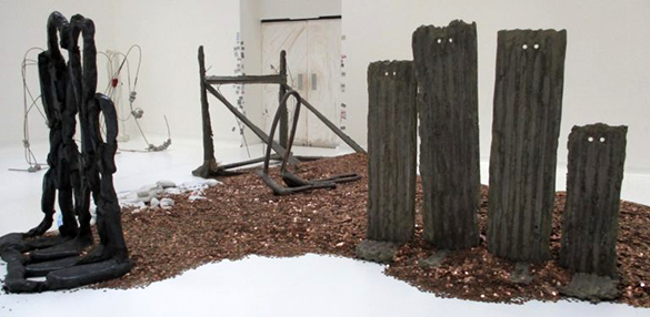
Michael Dean
I am captivated by four standing slats of corrugated iron. Each has two holes near the top. These eye-holes transform the slats into a dull humanoid family whose feet are planted in a thick layer of coppery glittering grit. I move in for a closer look. The grit consists of thousands upon thousands of one-penny pieces. That feeling of outrage is finding a focus.
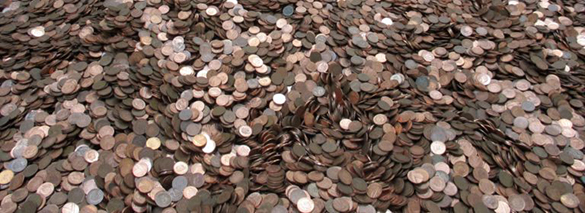
Michael Dean
The title of this work takes some beating: “United Kingdom poverty line for two adults and two children: twenty thousand four hundred and thirty six pounds sterling as published on 1st September 2016″ This annual subsistence sum is represented here by 2,043,600 pennies. In fact, there is one penny less. When installing the work, Dean removed one coin meaning that the family has to get by on one penny less than the poverty line.
I later ask myself if I am qualified to judge these works and commit my judgement to e-print. One internal voice tells me this would be unwise; I am not swimmer enough to plunge into such controversial waters. Another voice tells me that not so many people are prepared to take the plunge and I may swim as strongly as anyone who is. Whatever, here’s my judgement for what it’s worth. Dean!