An extinct car in Schiphol airport!

Schiphol

I hurry through Amsterdam’s crowded Schiphol airport late for my flight connection. Whooaaaaa! What’s that? I snap a photo. Others do the same. I assume the airport authorities have commissioned some contemporary sculpter to lighten the mood of stressed travellers. But, no! This is an advertisement for Sixt Car Rentals. Well…. they certainly caught my eye. The wooden board reads: “Thanks to Sixt, expensive car rentals are extinct.” Bravo, Sixt! Nice idea!

It works. I love the skeletal dinosaur theme implying extinction. Yet it’s clearly based on a reasonably modern car. And it makes me laugh. I particularly like the spoiler and the little boney rear-view mirror. But of course, it’s basic appeal (for me at least) is because of it’s immediate association with The Flintstones. Talking of whom…. I understand that a recent survey of Middle Eastern countries about American television reveals that the people in Kuwait don’t like Fred Flintstone, but the people in AbuDhabidoooooooo!

Matisse (and friends) in Martigny

Matisse 1

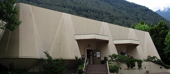
Martigny. Gateway to the Swiss alps. It’s a rainy day and so a great day to visit the current exhibition at the imposing Pierre Gianadda Foundation. Posters advertise “Matisse in his time.” This must-see ambitious exhibition is a sumptuous banquet of beautiful stuff. Some surprising dishes await you!

Matisse 2

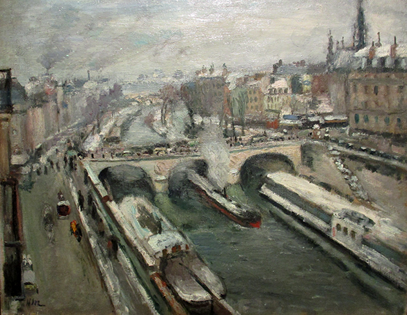
“Pont Saint-Michel, effet de neige” Henri Matisse 1907

Early days! Henry Matisse (1869 – 1954) painted this wintery view from the studio of Gustave Moreau in Paris in 1907.

Matisse 3

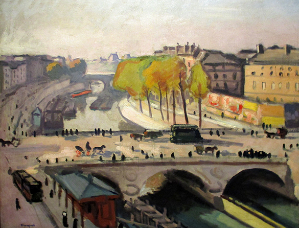
“Pont Saint-Michel et le quai des Grands Augustins” Albert Marquet 1912

His friend, Albert Marquet, studied at the same studio.

Throughout his long and lauded career, Matisse led, rejected and experimented with a variety of “isms” including fauvism and cubism. The team at the Gianadda Foundation have picked out different phases of his remarkable curriculum vitae by the clever juxtaposition of his paintings with those of contemporaries.

Matisse 4

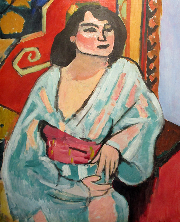
“L’Algérienne” Henri Matisse 1909

Matisse 5

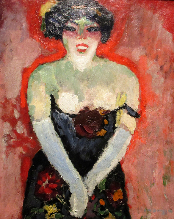
“Chanteuse de cabaret” Kees van Dongen 1906

Along with his friends – and Picasso, his life-long rival whom he first met in 1906 – Matisse worked the theme of the reclining female nude. Most of his output in the 1920s turned around the “Odalisques” of the Middle-East.

Matisse 6

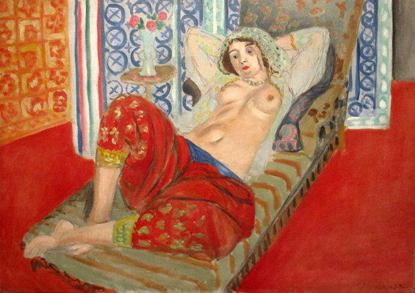
“Odalisque à la culotte rouge” Henri Matisse 1921

The details on the screens and on the red pantaloons resonate. This painting is much more than a sad-sensuous semi-nude. It is a herald of what Matisse was to develop twenty years later.

Matisse 7

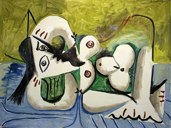
“Femme couchée sur un divan bleue” Pablo Picasso 1960

I overhear another visitor stating that an artist – even Picasso – shouldn’t portray women in such an undignified pose! The anatomist in me has some sympathy for this view. However, I am sure good old Pablo was aiming to provoke just such a reaction and, right now, is still laughing at us.

To entrench the exhibition’s theme of rivalry between these two creative giants of the twentieth century, two large canvases are placed next to each other.

Matisse 8

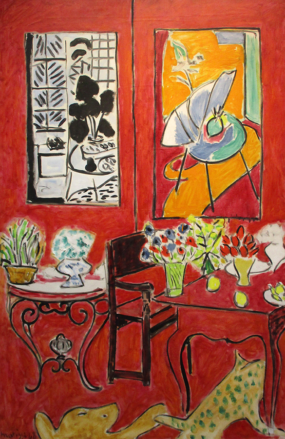
“Grand intérieur rouge” Henri Matisse 1948

Matisse 9

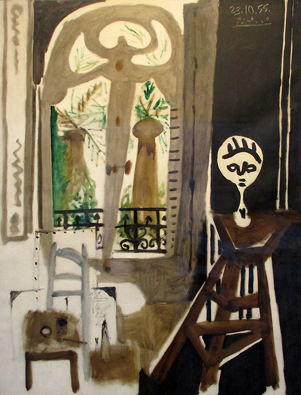
“L’Atelier” Pablo Picasso 1955

I “like” both. (Neither bowl me over!) I am left with a feeling that a comparison is invited when a comparison is inadvisable if not impossible.

An annex houses one of the exhibition’s delightful surprises. It is a collection of photo-portraits of famous artists by Henri Cartier-Bresson.

Matisse 10

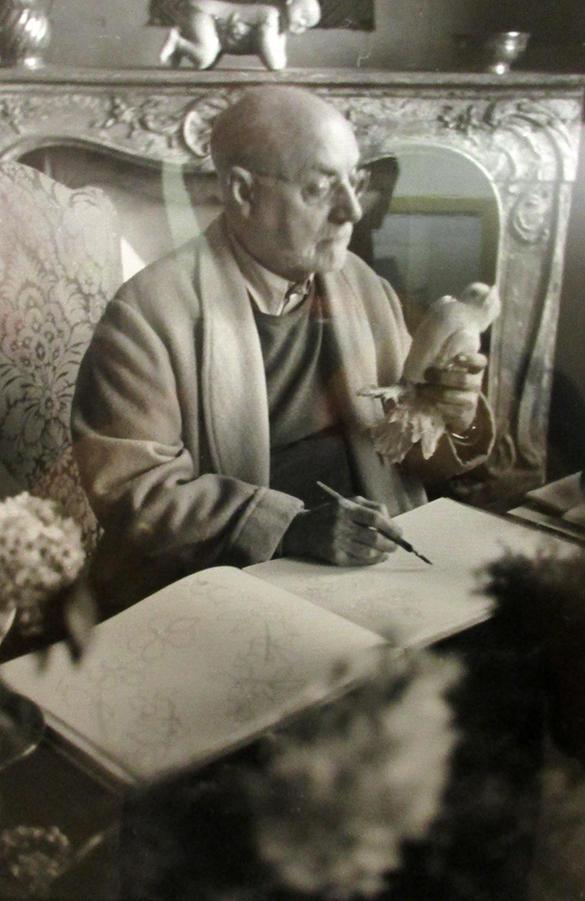
Portrait of Henri Matisse. Henri Cartier-Bresson 1943

I adore this photograph. It speaks volumes. It was taken when Matisse began to develop his final, jubilatory gouache “découpages.” The man holds a dove in his left hand whilst drawing with his right. But the hands are thin. There is an air of infirmity despite the ornate surroundings. The photograph was taken not long after Matisse went through major abdominal surgery.

The other delightful surprise is a large series of prints from Matisse’s découpages. These works introduced a previously unseen interaction of line and colour. They were born of time and creative genius. They must be among the most important twentieth century influences on not only other painters and designers but also on what is generally perceived as “beautiful.” Up until this point such an image of a funeral hearse was unimaginable!

Matisse 11

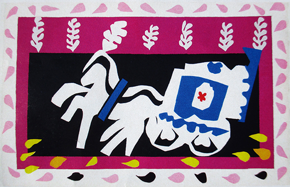
“Série Jazz – L’enterrement de Pierrot” Henri Matisse 1947

I doff my hat to the Gianadda Foundation for how they recount the wonderful narrative of the work of Henri Matisse (and friends.) It really is worth the trip to Martigny.

Talking Beautiful Stuff thanks the Fondation Pierre Gianadda for permission to take the photographs shown here. Beautiful Stuff!

Those Swiss cows!

And poster of the week is……. Les Fêtes de Genève!

Cows 1

Most effective posters carry strong subliminal messages. One of the most frequently used visual tricks in poster design is the inclusion of images of beautiful people – usually female. Buy this product and you will become as beautiful as this! Go on holiday to this island and you will meet beautiful people like this! etc. etc. Shallow stuff! Here in Switzerland, the designers of posters dig deep into the national psyche. There is a kind of comfortable, traditional-rustic-alpine and non-threatening feel about the common Swiss identity. The visual key is…. yes….. cows! Images of the female bovine are everywhere. But it kind of makes sense. Milk! Swiss cheese! Swiss chocolate! However, I really don’t understand how invoking the cow theme can attract people to the Geneva Festival which is more about music, fireworks, fairgrounds and parades. I’ve lived in Geneva for twenty years and never seen a pat on a pavement. There must be a sublimimnal message here but I just don’t get it. Let’s look elsewhere!

Cows 2

Hi everybody! Swatch! Possible subliminal message: “Buy our cow-bell version and you will become Swiss in spirit because your new purchase will transport you back in time to an era of happy mountain peasants blowing alpine horns in high pastures thick with eidelweiss!” Don’t you love the chunks of holeful cheese flying out of those long horns? And what about the steely stare of the lying cow defying the viewer to walk away without a new Swatch! The traditional mountaineer’s hat on the back of the prozac-free cow is just so photoshopped. The whole thing makes me chuckle. But I figure they’ve done their market research. The real subliminal message may be as simple as: “Buy a Swatch because we all just love cows and laugh about it!” I’ve found that Swiss people really do have a sense of humour. In addition, they are bafflingly law-abiding…..

Cows 3

OK… it’s not a poster. But, I rest my case. Somewhere, an official decided that this radar speed trap on the rue de Lausanne heading out of Geneva should be painted like a cow. Camouflage? Unlikely. Or does it mean: “Breaking the speed limit risks cracking the very foundations of our culture.”? Would it be more effective to cover the device with an image of a pouting glossy-lipped beauty promising a kiss and/or good looks to anyone driving less than 50kph? In this town, I think not.

Disclaimer: No Swiss cows were harmed in the writing of this article. Any link to real Swiss cows is purely coincidental. Talking Beautiful Stuff apologises to Swiss cows for any unintended offense.