Big luggage people at Amsterdam airport

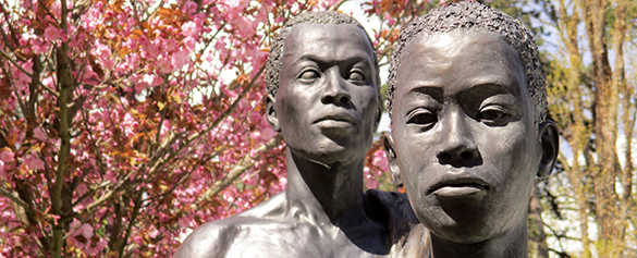
I am in transit at Amsterdam’s Schipol airport. Everyone is in a controlled rush. Irritated travellers swerve around me when I stop to take a photo of two huge figures that sit in the middle of the walkway. Before I too move on, I feel the surface of a massive bronze shoulder; it is cold and assertive. I tap my knuckle against it and am rewarded with a satisfying note, deep and rich.

Big luggage people

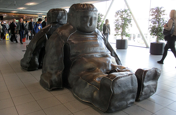
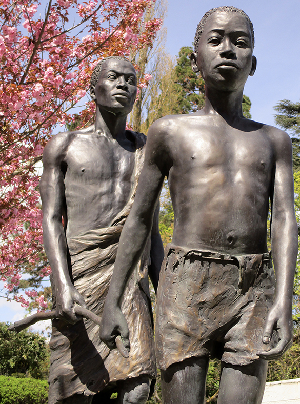
Tom Claassen “Two incredible sitting black snowmen” Bronze 2000

I have seen Tom Claassen‘s “Two incredible sitting black snowmen” before. I wasn’t wowed. However, finding them here really grabs my attention and flicks the mental switch on a little bit of neuronal circuitry that tells me “This is beautiful stuff!” I guess it’s about context.

Claassen’s figures look like two tired people. Their sitting pose is weighty but anatomic nevertheless. I am reminded of a couple of breathless fat kids after PE. At the same time, with their seams and soft corners, they represent battered baggage waiting to be collected. The in-context appeal comes from the fact that they represent us, how we feel and what we take with us when we travel. Passengers and luggage, as far as airlines and airports are concerned, are commodities that have to be moved around efficiently. Inevitably, our air travel experience involves total depersonalisation. So, just look at the lack of any human expression on the faces of our bronze friends!

Another subliminal bobs to the surface. It’s the fat kid thing combined with the resemblance to couches upon which we sit and watch television. The western world is currently gripped by an epidemic of obesity. Hence, these figures are totally contemporary in their placement at Schipol. With a kind of tired ambivalence we just accept the  inconvenience and discomfort of air travel as we expect convenient access to comfort food.

No surprise that, given the chance, I would rename Claassen’s masterpiece “Big luggage people.” Bravo team Classens – Schipol!

The river blindness sculpture at the World Health Organisation

River blindness 1

I am at entrance of the World Health Organisation. People of all nationalities hurry by with laptops and bulging files. There is a sculpture that I too have hurried by over the years. Today, I have time to take a closer look.

When it comes to depicting the human form, what makes the difference between a good sculpture and a great sculpture is what one sees in the eyes. The eyes are, after all, that part of another person at which we look most intently. What I see here is a man and a boy. Both are clearly African. The man’s eyes are clouded over; dead. The boy sees clearly but his expression is that of determined resignation to his lot.

River blindness 2

A son leads his blind father with the aid of a stick. They are both caught in grinding poverty. The sculpture marks the near-elimination of the parasite causing river blindness (Onchocerciasis) in eleven West African countries through the Onchocerciasis Control Programme. There is an element of hope for the generation who might, thanks to the combined efforts of multiple agencies guided by the WHO, be free of this terrible disease. This noble institution gets a political bashing on many fronts but it is well to remember its successes. And these successes are brought about by committed people who hurry by with laptops and bulging files. All that said, this commemorative work is technically accomplished, full of narrative and eye-smartingly poignant. I should have stopped and taken all this in before.

It is a clear bright spring day. I take my time snapping a few photos. I look for the little plaque that gives the name of the master sculptor responsible for this beautiful stuff. There is no plaque. There is no recognition of the genius who made it. Does anyone know whose work this is?

Lunch at the Ariana

I am early for a lunch meeting at the Ariana Museum. I take a seat in the discrete little restaurant. The tables are as yet empty. There is a display of large china dishes and vases. Not so surprising given this museum’s standing in the world of ceramics and glassware.

Ariana 1

Jan De Vliegher “China Blue V&A” 2014 Acrylic on canvas

Then a double-take. This is not a display case. It’s a painting! I approach Jan De Vliegher‘s “China Blue V&A” in awe. The realism is extraordinary.

Ariana 2

Detail of China Blue V&A

More extraordinary still is that the tones, perspective and depth of field have been produced by a combination of the boldest of brush strokes, splashes and drips; a technique rarely associated with, let alone accomplishing, realism. I can’t draw my eyes away from this painting. This is master-class beautiful stuff.

Ariana 3

Paul March “In Pulverum Speramus” Clay, 2015

After lunch, I look around the rest of the museum. In a corner by a door I stumble upon something recognisably from the studio of Paul March. Five smooth ceramic forms are arranged in the pose of a sleeping dog. I want to pick up each part and heft it in my hand. The whole is pleasing. Although caught between abstraction and canine imagary, the piece captures the awkwardness of man’s best friend lying on a hard floor. The title is “In Pulverum Speramus.” My schoolboy latin tells me this reads something like “We hope in the dust.” (Perhaps Paul will tell us the “why” of this title?) His work has a way of finding corners in the Ariana. Remember his spider?

Nice day! Lunch with surprises! But then the Ariana has a way of serving up surprises.